# Numeric
x <- 1
y <- 3.14
z <- 1e4        # scientific notation

# Math operations
x + y
[1] 4.14(x + 1) * y # follows PEMDAS[1] 6.28sqrt(y)[1] 1.772005log(y)[1] 1.144223y^2[1] 9.8596PLS 206 — Applied Multivariate Modeling
Everything in this course fits into one repeating cycle:
Collect data → Explore → Test / Model → CommunicateThis module covers the first two steps — loading data and exploring it — plus the classical hypothesis tests you’ll need when relationships are simple. Modules 2–10 build the modeling toolkit for when they’re not.
The single most important habit in data analysis: look at your data before you model it. Summary statistics can be identical across wildly different datasets (see Activity 3). Plot first, model second.
R is free, open-source, and used by ecologists, geneticists, agronomists, and data scientists worldwide. With 10,000+ packages on CRAN, it covers nearly every statistical method you’ll need. More importantly, your entire analysis lives in a script — reproducible, shareable, and tweakable.
This quarter we’ll use R for linear and generalized linear models, GAMs, regularization, PCA, clustering, random forests, neural nets, and SEM.
# Numeric
x <- 1
y <- 3.14
z <- 1e4 # scientific notation
# Math operations
x + y[1] 4.14(x + 1) * y # follows PEMDAS[1] 6.28sqrt(y)[1] 1.772005log(y)[1] 1.144223y^2[1] 9.8596Use <- for assignment. Reserve = for function arguments only.
x <- 42 ; class(x) # numeric[1] "numeric"w <- "hello" ; class(w) # character[1] "character"flag <- TRUE ; class(flag) # logical[1] "logical"myvar <- 10
myvar == 10 # TRUE[1] TRUEmyvar > 2 # TRUE[1] TRUEmyvar < 2 # FALSE[1] FALSER will silently coerce types when you combine mismatched data — a common source of bugs when reading CSVs. Always check with class() or str() after import.
# Convert between types explicitly
x_char <- "3.14"
class(x_char)
[1] "character"as.numeric(x_char) # "3.14" → 3.14[1] 3.14# The factor → numeric gotcha (one of R's most common traps)
f <- factor(c("10", "2", "30"))
as.numeric(f) # WRONG: returns factor level codes (1, 2, 3), not values![1] 1 2 3as.numeric(as.character(f)) # CORRECT: go via character first[1] 10 2 30Never convert a factor directly to numeric. Always go as.numeric(as.character(x)).
Everything in R is a vector. A single number is a vector of length 1.
numbers <- c(1, 2, 3, 4, 5, 10)
words   <- c("apple", "banana", "cherry", "grape")

class(numbers)
[1] "numeric"length(numbers)[1] 6# Sequences
10:20 [1] 10 11 12 13 14 15 16 17 18 19 20seq(from = 1, to = 100, by = 10) [1] 1 11 21 31 41 51 61 71 81 91numbers * 2 # element-wise math[1] 2 4 6 8 10 20numbers[4:6] # index by position[1] 4 5 10words[2][1] "banana"numbers[which(numbers > 3)] # index by condition[1] 4 5 10numbers[numbers > 3] # shorthand[1] 4 5 10words %in% c("apple", "grape") # membership test[1] TRUE FALSE FALSE TRUEwords[words %in% c("apple", "grape")][1] "apple" "grape"# NA values propagate — use na.rm = TRUE
x <- c(1, 2, NA, 4)
is.na(x)[1] FALSE FALSE TRUE FALSEmean(x) # NA — because of the missing value[1] NAmean(x, na.rm = TRUE) # 2.333...[1] 2.333333# Check for NAs across a data frame column-by-column
# colSums(is.na(df))
# Factors (categorical variables)
fruits <- factor(c("apple", "banana", "apple", "cherry"))
levels(fruits)[1] "apple" "banana" "cherry"table(fruits)fruits
apple banana cherry
2 1 1 # Lists hold mixed types
my_list <- list(number = 42, word = "hello", flag = TRUE)
my_list$number[1] 42my_list[["word"]][1] "hello"# Data frames = the workhorse for your data
df <- data.frame(
rep = c(1, 2, 3, 4),
treat = c("A", "B", "A", "B"),
value = c(10.2, 8.5, 11.1, 9.3)
)
str(df)'data.frame': 4 obs. of 3 variables:
$ rep : num 1 2 3 4
$ treat: chr "A" "B" "A" "B"
$ value: num 10.2 8.5 11.1 9.3df$value # access a column[1] 10.2 8.5 11.1 9.3df[1, ] # first row rep treat value
1 1 A 10.2df[df$treat == "A", ] # filter rows rep treat value
1 1 A 10.2
3 3 A 11.1# Quick looks at your data
head(df) # first 6 rows (default) rep treat value
1 1 A 10.2
2 2 B 8.5
3 3 A 11.1
4 4 B 9.3tail(df) # last 6 rows — good for checking import completeness rep treat value
1 1 A 10.2
2 2 B 8.5
3 3 A 11.1
4 4 B 9.3head(df, 10) # first 10 rows rep treat value
1 1 A 10.2
2 2 B 8.5
3 3 A 11.1
4 4 B 9.3# Add a column
df$log_value <- log(df$value)
summary(df) rep treat value log_value
Min. :1.00 Length:4 Min. : 8.500 Min. :2.140
1st Qu.:1.75 Class :character 1st Qu.: 9.100 1st Qu.:2.208
Median :2.50 Mode :character Median : 9.750 Median :2.276
Mean :2.50 Mean : 9.775 Mean :2.275
3rd Qu.:3.25 3rd Qu.:10.425 3rd Qu.:2.344
Max. :4.00 Max. :11.100 Max. :2.407 wine <- read.csv("winedata.csv")
str(wine)'data.frame': 178 obs. of 14 variables:
$ Cultivar : chr "barolo" "barolo" "barolo" "barolo" ...
$ Alcohol : num 14.2 13.2 13.2 14.4 13.2 ...
$ AlcAsh : num 15.6 11.2 18.6 16.8 21 15.2 14.6 17.6 14 16 ...
$ Ash : num 2.43 2.14 2.67 2.5 2.87 2.45 2.45 2.61 2.17 2.27 ...
$ Color : num 5.64 4.38 5.68 7.8 4.32 6.75 5.25 5.05 5.2 7.22 ...
$ Flav : num 3.06 2.76 3.24 3.49 2.69 3.39 2.52 2.51 2.98 3.15 ...
$ Hue : num 1.04 1.05 1.03 0.86 1.04 1.05 1.02 1.06 1.08 1.01 ...
$ MalicAcid : num 1.71 1.78 2.36 1.95 2.59 1.76 1.87 2.15 1.64 1.35 ...
$ Mg : int 127 100 101 113 118 112 96 121 97 98 ...
$ NonFlavPhenols: num 0.28 0.26 0.3 0.24 0.39 0.34 0.3 0.31 0.29 0.22 ...
$ OD : num 3.92 3.4 3.17 3.45 2.93 2.85 3.58 3.58 2.85 3.55 ...
$ Phenols : num 2.8 2.65 2.8 3.85 2.8 3.27 2.5 2.6 2.8 2.98 ...
$ Proa : num 2.29 1.28 2.81 2.18 1.82 1.97 1.98 1.25 1.98 1.85 ...
$ Proline : int 1065 1050 1185 1480 735 1450 1290 1295 1045 1045 ...head(wine) Cultivar Alcohol AlcAsh Ash Color Flav Hue MalicAcid Mg NonFlavPhenols
1 barolo 14.23 15.6 2.43 5.64 3.06 1.04 1.71 127 0.28
2 barolo 13.20 11.2 2.14 4.38 2.76 1.05 1.78 100 0.26
3 barolo 13.16 18.6 2.67 5.68 3.24 1.03 2.36 101 0.30
4 barolo 14.37 16.8 2.50 7.80 3.49 0.86 1.95 113 0.24
5 barolo 13.24 21.0 2.87 4.32 2.69 1.04 2.59 118 0.39
6 barolo 14.20 15.2 2.45 6.75 3.39 1.05 1.76 112 0.34
OD Phenols Proa Proline
1 3.92 2.80 2.29 1065
2 3.40 2.65 1.28 1050
3 3.17 2.80 2.81 1185
4 3.45 3.85 2.18 1480
5 2.93 2.80 1.82 735
6 2.85 3.27 1.97 1450Always run str() after reading data — verify that column types match what you expect (e.g., numeric not character).
# Save a modified data frame
write.csv(wine, "winedata_clean.csv", row.names = FALSE)You will see |> (base R pipe, R ≥ 4.1) and %>% (magrittr, from the tidyverse) constantly in R code online. They both mean the same thing: pass the left-hand side as the first argument to the right-hand side.
# These three are identical:
mean(c(1, 2, 3, NA), na.rm = TRUE)
[1] 2c(1, 2, 3, NA) |> mean(na.rm = TRUE)[1] 2# Reading it aloud: "take this vector, THEN compute the mean"Pipes shine when you chain multiple operations:
# Without pipe — reads inside-out
round(sqrt(abs(-16)), 2)
[1] 4# With pipe — reads left to right
-16 |> abs() |> sqrt() |> round(2)[1] 4|> is built into R ≥ 4.1 — no packages needed. %>% requires library(magrittr) or library(dplyr). They behave identically in most cases. Prefer |> in new code.
When you need to do the same operation across many columns or groups, reach for apply() or sapply() instead of copy-pasting code. This will come up immediately in the problem set.
data(iris)

# apply() — loops over rows (MARGIN=1) or columns (MARGIN=2) of a matrix/data frame
apply(iris[, 1:4], MARGIN = 2, FUN = mean)   # mean of each numeric column
Sepal.Length Sepal.Width Petal.Length Petal.Width
5.843333 3.057333 3.758000 1.199333 # sapply() — loops over a vector or list, returns a simplified result
sapply(iris[, 1:4], sd) # SD of each numeric columnSepal.Length Sepal.Width Petal.Length Petal.Width
0.8280661 0.4358663 1.7652982 0.7622377 # Equivalent for loop (more verbose, same result)
for (col in names(iris)[1:4]) {
cat(col, "mean =", mean(iris[[col]]), "\n")
}Sepal.Length mean = 5.843333
Sepal.Width mean = 3.057333
Petal.Length mean = 3.758
Petal.Width mean = 1.199333 More on apply(), lapply(), and writing your own functions comes in Module 2. For now, the pattern is: apply(data_frame, 2, some_function).
ggplot2 builds plots layer by layer:
ggplot(data, aes(x = ..., y = ...)) +
  geom_*()   +    # geometry: points, lines, bars, histograms ...
  labs()     +    # labels
  theme_*()       # styling
Every plot starts with ggplot(). Add layers with +.
The first thing to do with any new variable — look at its distribution.
library(ggplot2)

# Histogram
ggplot(iris, aes(x = Sepal.Length)) +
  geom_histogram(bins = 20, fill = "steelblue", color = "white") +
  labs(x = "Sepal Length (mm)", y = "Count") +
  theme_classic()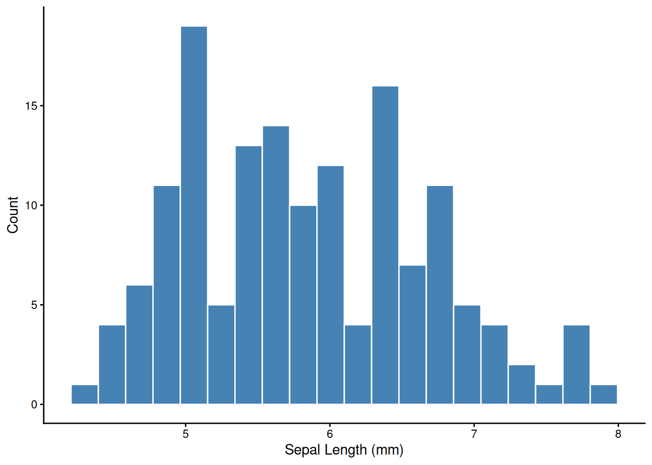
# Density curve — smooth estimate of the distribution
ggplot(iris, aes(x = Sepal.Length, fill = Species)) +
  geom_density(alpha = 0.4) +
  labs(x = "Sepal Length (mm)", y = "Density") +
  theme_classic()
ggplot(iris, aes(x = Sepal.Length, y = Sepal.Width)) +
  geom_point()
ggplot(iris, aes(x = Sepal.Length, y = Sepal.Width)) +
  geom_point() +
  geom_smooth(method = "lm")
ggplot(iris, aes(x = Sepal.Length, y = Sepal.Width, col = Species)) +
  geom_point() +
  geom_smooth(method = "lm")
facet_wrap() splits one plot into panels by a grouping variable — one of ggplot’s most powerful tools for exploratory analysis.
ggplot(iris, aes(x = Sepal.Length, y = Petal.Length)) +
  geom_point(alpha = 0.6) +
  geom_smooth(method = "lm", se = FALSE) +
  facet_wrap(~ Species) +
  theme_classic()
ggplot(iris,
       aes(x = Sepal.Length, y = Sepal.Width,
           col = Species, fill = Species)) +
  geom_point(alpha = 0.7) +
  geom_smooth(method = "lm", alpha = 0.1) +
  labs(title = "Iris Dataset",
       x = "Sepal Length (mm)",
       y = "Sepal Width (mm)") +
  scale_color_manual(values = c("gray30", "dodgerblue", "orange")) +
  scale_fill_manual(values  = c("gray30", "dodgerblue", "orange")) +
  theme_classic(base_size = 14) +
  theme(plot.title = element_text(face = "bold"),
        legend.position = "top")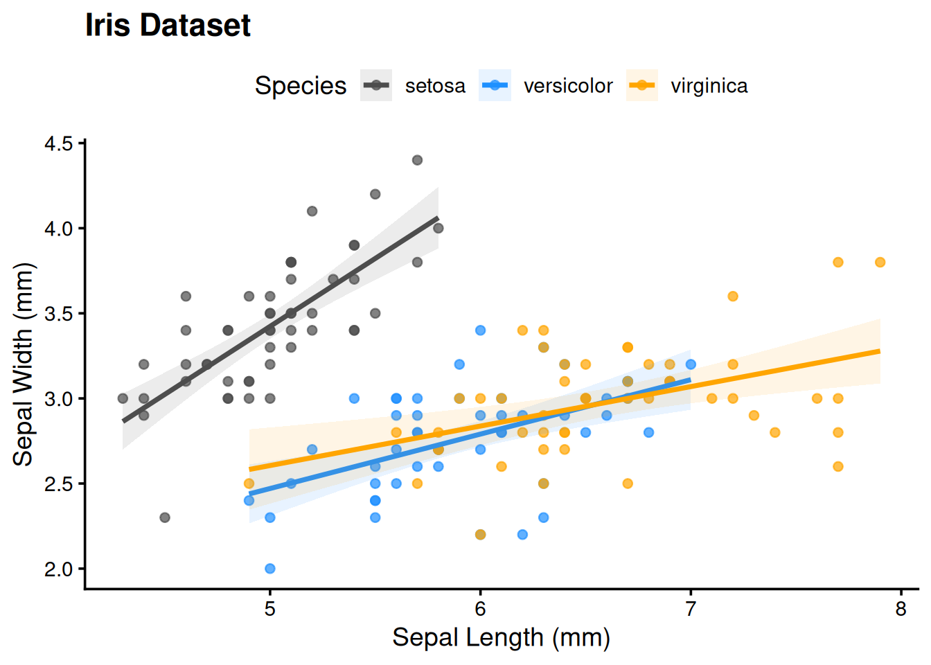
# Save the last plot as a PDF (preferred for publication)
ggsave("sepal_scatter.pdf", width = 5, height = 4)

# Or save a named plot object
p <- ggplot(iris, aes(Sepal.Length, Sepal.Width)) + geom_point()
ggsave("sepal.png", plot = p, width = 5, height = 4, dpi = 300)Use ggsave() rather than screenshot. It gives you a reproducible, high-resolution file at any dimension you need.
The GGally package extends ggplot2 with ggpairs() — a scatter plot matrix showing pairwise relationships, distributions, and correlations in one figure. You’ll use it in the problem set:
library(GGally)
ggpairs(wine_reduce, columns = 2:7)                     # all pairs
ggpairs(wine_reduce, aes(col = Cultivar), columns = 2:7) # colored by groupBefore running any tests, anchor the key concepts.
A p-value is the probability of observing a result at least this extreme if the null hypothesis were true. It is not:
p < 0.05 does not mean the effect is real or important. With n = 10,000, a trivially small effect will be significant. Always report both a p-value and an effect size.
| H₀ is actually true | H₀ is actually false | |
|---|---|---|
| Reject H₀ (p < α) | Type I error (false positive) — rate = α | Correct (true positive) — power = 1 − β |
| Fail to reject H₀ | Correct (true negative) | Type II error (false negative) — rate = β |
Setting α = 0.05 means you accept a 5% chance of a false positive per test — which becomes a serious problem when running many tests (see Multiple Comparisons below).
Statistical power (1 − β) is the probability of detecting a real effect. Power increases with larger sample size, larger effect size, and lower measurement noise. See the t-test Explorer to watch power change in real time.
| Outcome | Groups / structure | Normally distributed? | Test |
|---|---|---|---|
| Continuous | 1 group vs. fixed value | Yes | One-sample t-test |
| Continuous | 1 group vs. fixed value | No | Wilcoxon signed-rank |
| Continuous | 2 independent groups | Yes | Welch’s two-sample t-test |
| Continuous | 2 independent groups | No | Mann-Whitney U |
| Continuous | 2 paired / matched groups | Yes | Paired t-test |
| Continuous | 2 paired / matched groups | No | Wilcoxon signed-rank (paired) |
| Continuous | ≥ 3 independent groups | Yes | One-way ANOVA + TukeyHSD |
| Continuous | ≥ 3 independent groups | No | Kruskal-Wallis + pairwise Wilcoxon |
| Continuous | 2 continuous variables | Linear | Pearson correlation |
| Continuous | 2 continuous variables | Monotone / outliers | Spearman correlation |
| Categorical | 2 × 2 table, small n | — | Fisher’s exact |
| Categorical | 2 × 2 or larger, large n | — | Chi-squared |
Normality refers to your residuals, not your raw data. For small samples (n < 30), check with shapiro.test() and a QQ plot. For large samples, the central limit theorem means most tests are robust even with non-normal data.
set.seed(42)
data("PlantGrowth")

tapply(PlantGrowth$weight, PlantGrowth$group, summary)
$ctrl
Min. 1st Qu. Median Mean 3rd Qu. Max.
4.170 4.550 5.155 5.032 5.293 6.110
$trt1
Min. 1st Qu. Median Mean 3rd Qu. Max.
3.590 4.207 4.550 4.661 4.870 6.030
$trt2
Min. 1st Qu. Median Mean 3rd Qu. Max.
4.920 5.268 5.435 5.526 5.735 6.310 ggplot(PlantGrowth, aes(group, weight, fill = group)) +
geom_boxplot(show.legend = FALSE, alpha = 0.7) +
geom_jitter(width = 0.08, alpha = 0.5) +
labs(x = "Treatment", y = "Weight (g)") +
theme_classic()
Does the control group mean differ from 5.0 g?
ctrl <- subset(PlantGrowth, group == "ctrl")$weight
t.test(ctrl, mu = 5)
    One Sample t-test

data:  ctrl
t = 0.17355, df = 9, p-value = 0.8661
alternative hypothesis: true mean is not equal to 5
95 percent confidence interval:
 4.614882 5.449118
sample estimates:
mean of x
    5.032
Non-parametric alternative:
wilcox.test(ctrl, mu = 5, conf.int = TRUE)
    Wilcoxon signed rank exact test

data:  ctrl
V = 28, p-value = 1
alternative hypothesis: true location is not equal to 5
95 percent confidence interval:
 4.57 5.38
sample estimates:
(pseudo)median
5.04 x1 <- subset(PlantGrowth, group == "ctrl")$weight
x2 <- subset(PlantGrowth, group == "trt1")$weight
# Welch's t-test (default — allows unequal variances)
t.test(x1, x2)
    Welch Two Sample t-test

data:  x1 and x2
t = 1.1913, df = 16.524, p-value = 0.2504
alternative hypothesis: true difference in means is not equal to 0
95 percent confidence interval:
 -0.2875162  1.0295162
sample estimates:
mean of x mean of y
    5.032     4.661
# Mann-Whitney U (non-parametric)
wilcox.test(x1, x2, conf.int = TRUE)
    Wilcoxon rank sum test with continuity correction

data:  x1 and x2
W = 67.5, p-value = 0.1986
alternative hypothesis: true location shift is not equal to 0
95 percent confidence interval:
 -0.2899731  1.0100554
sample estimates:
difference in location
0.4213948 Welch’s t-test is the safe default — it doesn’t assume equal variances between groups.
Use a paired t-test when each observation in group A has a natural match in group B — before/after measurements on the same subject, plots receiving both treatments, twin studies. Pairing removes between-subject variation and increases power.
# Simulated example: soil nitrate (mg/kg) at 12 plots before and after treatment
set.seed(42)
pre  <- rnorm(12, mean = 10, sd = 2)
post <- pre + rnorm(12, mean = 2.5, sd = 1.5)   # treatment adds ~2.5 mg/kg

# Paired t-test
t.test(post, pre, paired = TRUE)
    Paired t-test

data:  post and pre
t = 3.0348, df = 11, p-value = 0.01135
alternative hypothesis: true mean difference is not equal to 0
95 percent confidence interval:
 0.4714789 2.9607031
sample estimates:
mean difference
       1.716091
# Equivalent: one-sample t-test on the differences
t.test(post - pre, mu = 0)
    One Sample t-test

data:  post - pre
t = 3.0348, df = 11, p-value = 0.01135
alternative hypothesis: true mean is not equal to 0
95 percent confidence interval:
 0.4714789 2.9607031
sample estimates:
mean of x
 1.716091
# Visualize paired structure
plot_df <- data.frame(
plot = rep(1:12, 2),
time = rep(c("Pre", "Post"), each = 12),
nitrate = c(pre, post)
)
plot_df$time <- factor(plot_df$time, levels = c("Pre", "Post"))
ggplot(plot_df, aes(x = time, y = nitrate, group = plot)) +
geom_line(alpha = 0.5) +
geom_point(size = 2) +
labs(x = NULL, y = "Nitrate (mg/kg)",
title = "Paired before/after measurements") +
theme_classic()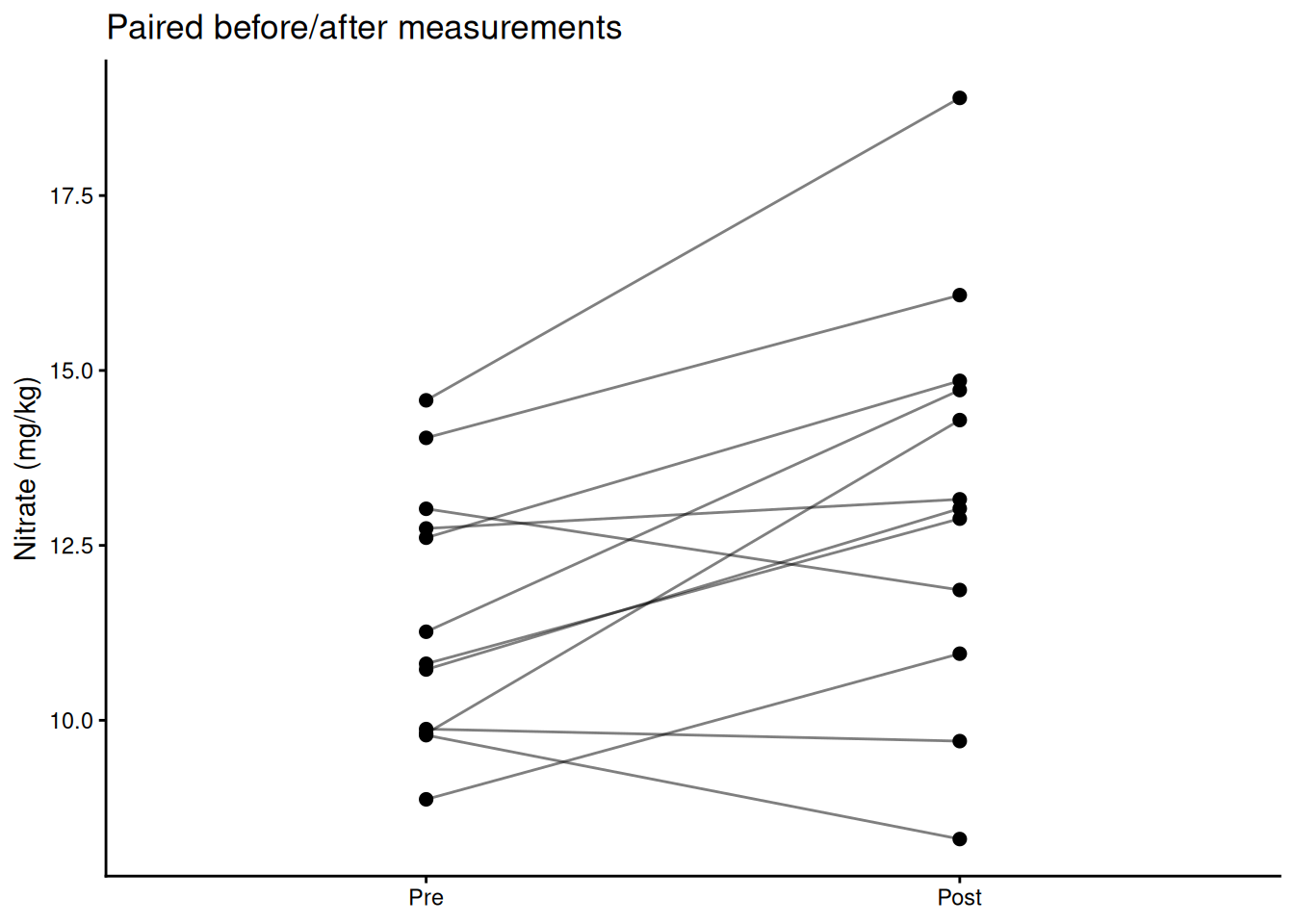
Non-parametric alternative:
wilcox.test(post, pre, paired = TRUE, conf.int = TRUE, exact = FALSE)
    Wilcoxon signed rank test with continuity correction

data:  post and pre
V = 70, p-value = 0.01673
alternative hypothesis: true location shift is not equal to 0
95 percent confidence interval:
 0.4077382 3.2019135
sample estimates:
(pseudo)median
2.045461 A significant p-value tells you the effect probably isn’t zero. Effect size tells you how big it is — which is what actually matters for biology.
\[d = \frac{|\bar{x}_1 - \bar{x}_2|}{s_\text{pooled}}\]
# Cohen's d for the two-sample comparison above
pooled_sd <- sqrt((var(x1) + var(x2)) / 2)
cohens_d  <- abs(mean(x1) - mean(x2)) / pooled_sd
cohens_d
[1] 0.5327478| d | Interpretation |
|---|---|
| < 0.2 | Negligible |
| 0.2 – 0.5 | Small |
| 0.5 – 0.8 | Medium |
| > 0.8 | Large |
η² is the proportion of total variance explained by the group factor — analogous to R² in regression.
model <- aov(weight ~ group, data = PlantGrowth)
ss    <- summary(model)[[1]][["Sum Sq"]]
eta_sq <- ss[1] / sum(ss)   # SS_group / SS_total
eta_sq
[1] 0.2641483Report effect sizes in your results. A biologically trivial effect can be highly significant with a large enough sample. A large effect can be non-significant with a small sample. Neither alone is the whole story.
Do all three treatment groups differ?
model <- aov(weight ~ group, data = PlantGrowth)
summary(model)
Df Sum Sq Mean Sq F value Pr(>F)
group 2 3.766 1.8832 4.846 0.0159 *
Residuals 27 10.492 0.3886
---
Signif. codes: 0 '***' 0.001 '**' 0.01 '*' 0.05 '.' 0.1 ' ' 1Post-hoc pairwise comparisons:
TukeyHSD(model) Tukey multiple comparisons of means
95% family-wise confidence level
Fit: aov(formula = weight ~ group, data = PlantGrowth)
$group
diff lwr upr p adj
trt1-ctrl -0.371 -1.0622161 0.3202161 0.3908711
trt2-ctrl 0.494 -0.1972161 1.1852161 0.1979960
trt2-trt1 0.865 0.1737839 1.5562161 0.0120064ggplot(PlantGrowth, aes(group, weight, fill = group)) +
geom_boxplot(alpha = 0.75, show.legend = FALSE) +
geom_jitter(width = 0.08, alpha = 0.6) +
labs(title = "Raw values (ANOVA)") +
theme_classic()
ggplot(PlantGrowth, aes(group, rank(weight), fill = group)) +
geom_boxplot(alpha = 0.75, show.legend = FALSE) +
geom_jitter(width = 0.08, alpha = 0.6) +
labs(title = "Ranks (Kruskal-Wallis)") +
theme_classic()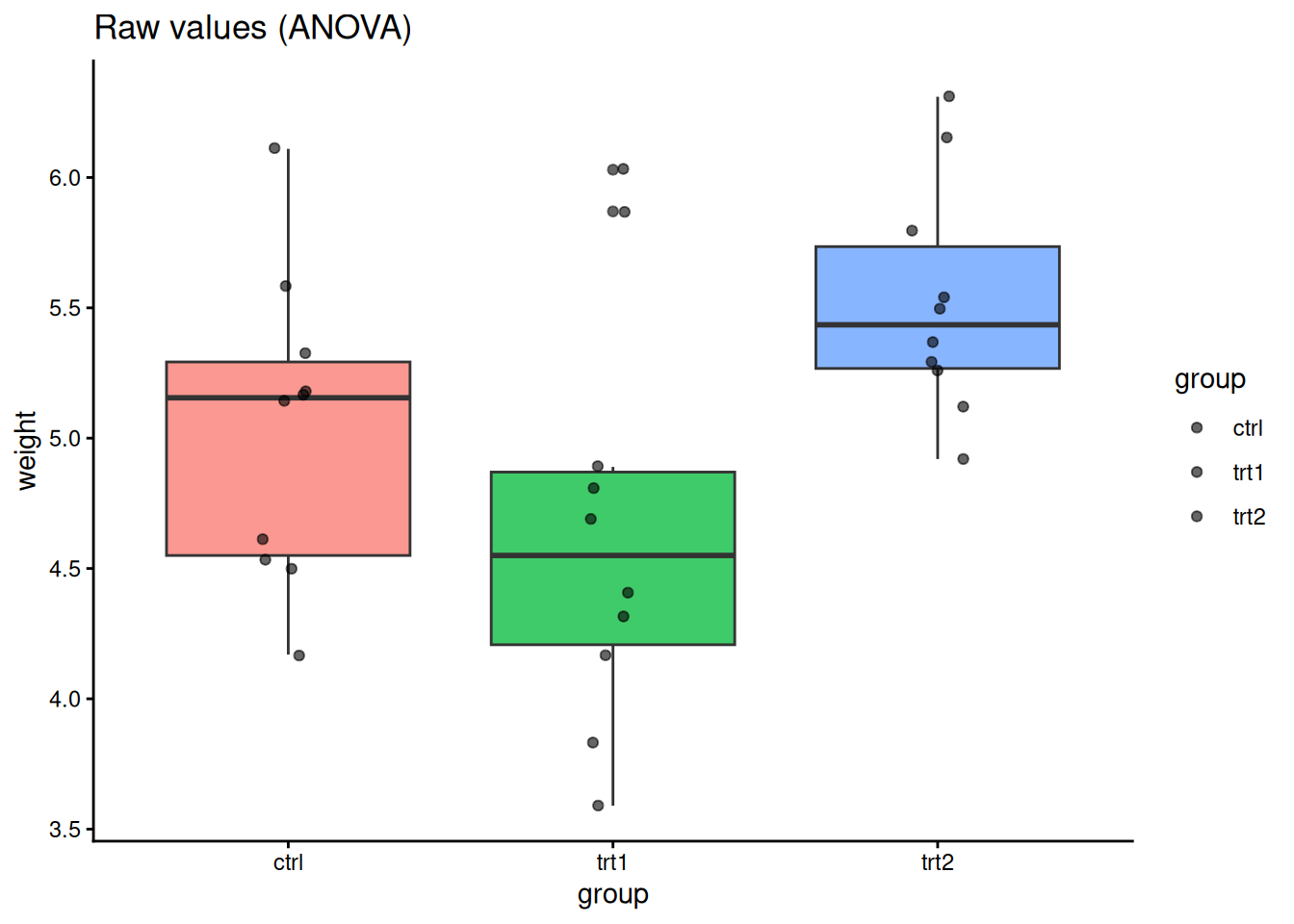
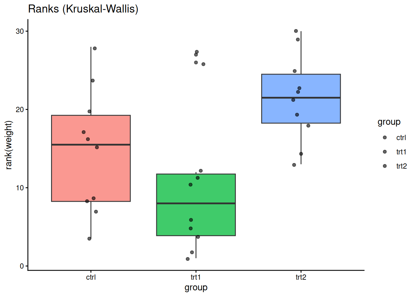
kruskal.test(weight ~ group, data = PlantGrowth)
    Kruskal-Wallis rank sum test

data:  weight by group
Kruskal-Wallis chi-squared = 7.9882, df = 2, p-value = 0.01842Every statistical test you run has a α = 0.05 chance of a false positive. If you run 20 independent tests, you expect one false positive on average — not because the biology changed, but because of random chance.
The problem: computing 10 pairwise correlations between wine variables gives you 10 chances for a spurious significant result. Running ANOVA post-hoc tests compounds the error further.
The solution: adjust p-values upward to account for the number of tests.
Common methods, roughly in order of conservatism:
pairwise.wilcox.test, p.adjust) — good general choice, less conservative than Bonferroni# Pairwise Wilcoxon with Holm correction
pairwise.wilcox.test(PlantGrowth$weight,
PlantGrowth$group,
p.adjust.method = "holm")
    Pairwise comparisons using Wilcoxon rank sum test with continuity correction

data:  PlantGrowth$weight and PlantGrowth$group

     ctrl  trt1
trt1 0.199 -
trt2 0.126 0.027

P value adjustment method: holm
# Manually adjust a vector of p-values
p_raw <- c(0.01, 0.04, 0.03, 0.20, 0.005)
p.adjust(p_raw, method = "holm")[1] 0.040 0.090 0.090 0.200 0.025p.adjust(p_raw, method = "fdr")[1] 0.025 0.050 0.050 0.200 0.025data("CO2")
sub <- subset(CO2, Type == "Quebec" & Treatment == "nonchilled")
cor.test(sub$conc, sub$uptake, method = "pearson")
    Pearson's product-moment correlation

data:  sub$conc and sub$uptake
t = 4.3196, df = 19, p-value = 0.0003695
alternative hypothesis: true correlation is not equal to 0
95 percent confidence interval:
 0.3910239 0.8709363
sample estimates:
      cor
0.7038936 cor.test(sub$conc, sub$uptake, method = "spearman", exact = FALSE)
    Spearman's rank correlation rho

data:  sub$conc and sub$uptake
S = 256.28, p-value = 2.691e-06
alternative hypothesis: true rho is not equal to 0
sample estimates:
      rho
0.8335869 ggplot(sub, aes(conc, uptake)) +
geom_point() +
geom_smooth(method = "lm", linewidth = 0.8) +
geom_smooth(method = "loess", linetype = 2, linewidth = 0.8) +
labs(title = "Raw", x = "CO2 concentration", y = "Uptake") +
theme_classic()
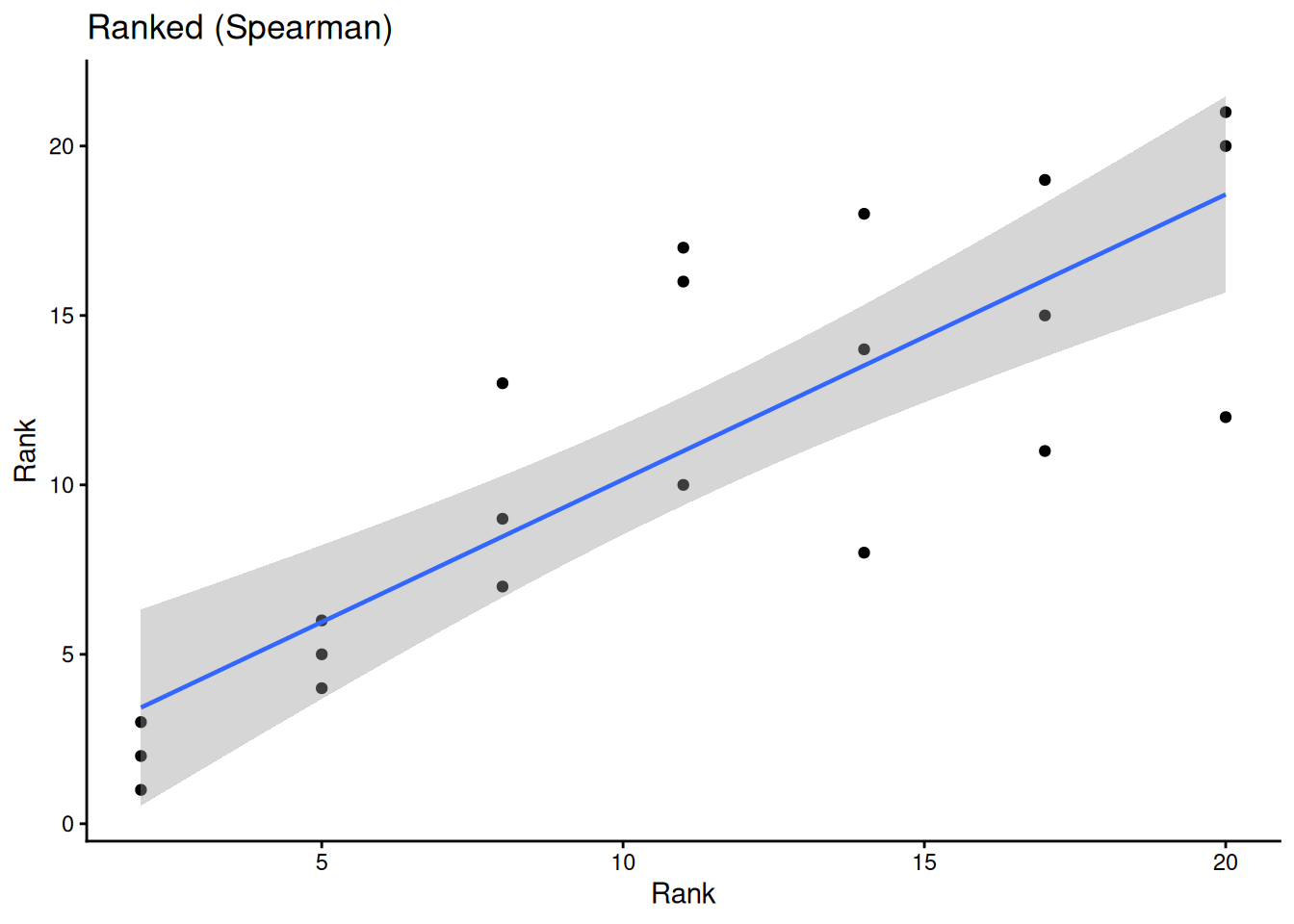
ggplot(sub, aes(rank(conc), rank(uptake))) +
geom_point() +
geom_smooth(method = "lm", linewidth = 0.8) +
labs(title = "Ranked (Spearman)", x = "Rank", y = "Rank") +
theme_classic()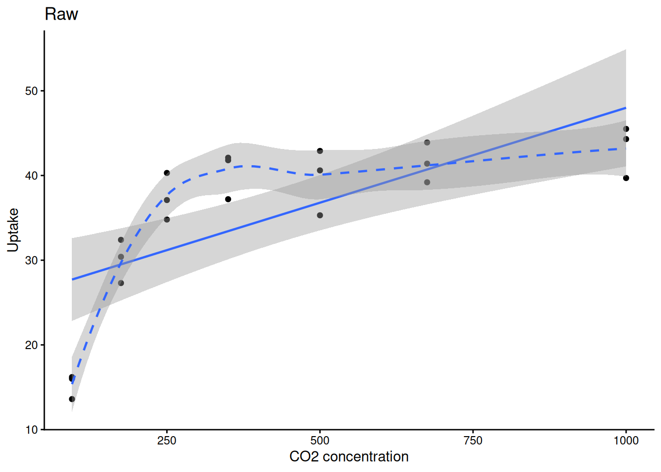
Is pest presence associated with treatment?
tab <- matrix(c(3, 17, 10, 10), nrow = 2, byrow = TRUE,
              dimnames = list(Pest = c("Present","Absent"),
                              Trt  = c("A","B")))
tab
Trt
Pest A B
Present 3 17
Absent 10 10fisher.test(tab)
    Fisher's Exact Test for Count Data

data:  tab
p-value = 0.04074
alternative hypothesis: true odds ratio is not equal to 1
95 percent confidence interval:
 0.02632766 0.94457354
sample estimates:
odds ratio
0.184812 chisq.test(tab, correct = FALSE)
    Pearson's Chi-squared test

data:  tab
X-squared = 5.584, df = 1, p-value = 0.01812Use Fisher’s exact when any cell count is < 5. Use chi-squared for larger samples.
Always check residuals, not the raw data:
model  <- aov(weight ~ group, data = PlantGrowth)
resids <- residuals(model)

hist(resids, main = "ANOVA residuals", col = "steelblue")
qqnorm(resids); qqline(resids, col = "red")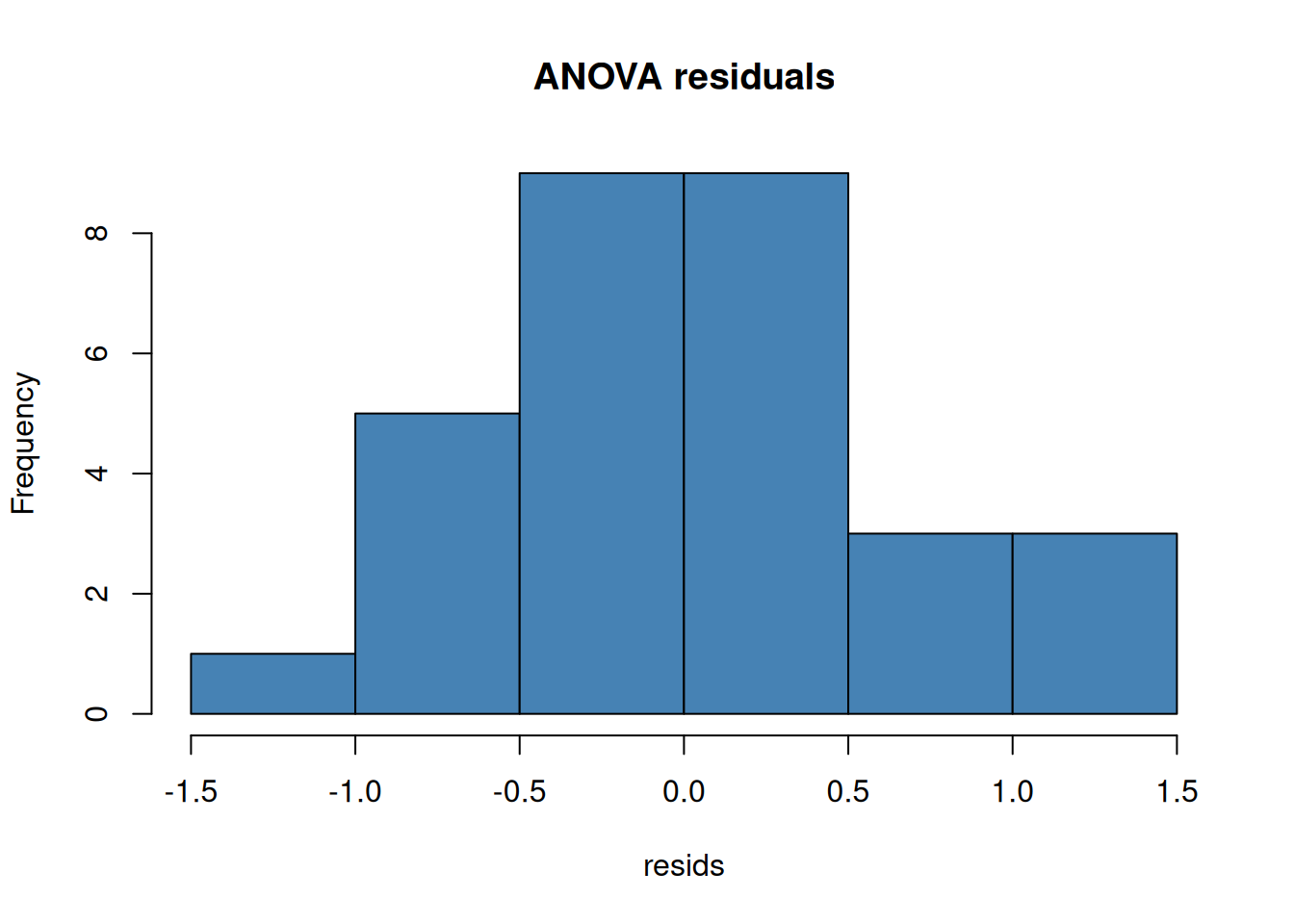
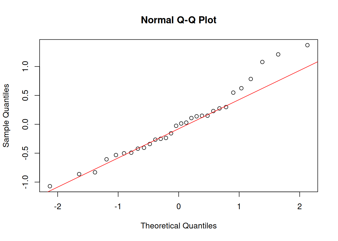
shapiro.test(resids)
    Shapiro-Wilk normality test

data:  resids
W = 0.96607, p-value = 0.4379| Topic | Key functions |
|---|---|
| Objects & vectors | c(), class(), str(), summary(), head(), tail() |
| Type coercion | as.numeric(), as.character(), as.factor() |
| Data frames | data.frame(), $, [ , ], subset(), colSums(is.na()) |
| I/O | read.csv(), write.csv() |
| Iteration | apply(), sapply() |
| Pipe | \|> (base R ≥ 4.1) |
| ggplot2 | geom_point(), geom_histogram(), geom_density(), geom_smooth(), facet_wrap(), ggsave() |
| t-tests | t.test() (one-sample, two-sample, paired), wilcox.test() |
| Effect size | Cohen’s d (manual), eta_sq from aov() summary |
| ANOVA | aov(), TukeyHSD(), kruskal.test() |
| Multiple testing | p.adjust() (holm, fdr, bonferroni) |
| Correlation | cor.test() (pearson & spearman) |
| Categorical | fisher.test(), chisq.test() |
| Normality | shapiro.test(), qqnorm() |
Problem Set: R Stats Intro — due the Wednesday of Module 2. Submit on Canvas.
Explore concepts interactively (no R needed): Module 1 Interactive Explorers